Digital design is a force to be reckoned with. The crux of the digital space is that the work is never truly complete. As digital agency designers gear up for the new year, they are perpetually upping the ante for web solutions and creations by innovating new integrated technologies and designs.
2017 was defined by debate on diversity, inclusivity, equality and sexism, encompassing every space from politics to Hollywood. Years such as this — where biases take center stage — puts inclusivity, diversity and acceptance at the forefront of design. Design is a reflection of our society and an indicator of where we are as a culture. And with great design power, comes great design responsibility.
The State of UX/UI – Polarized Web Design
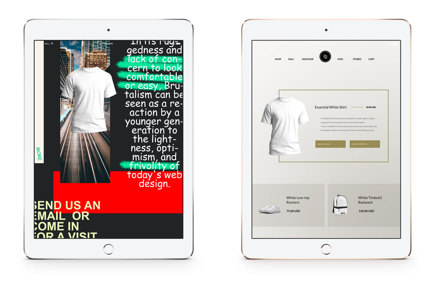
In 2017, we saw design like never before. Two extreme parallels rose to the top – minimalism and maximalism. We saw fearless, internet-breaking unconventional layouts and classic, clean minimalist web design. The beauty of this juxtaposition is that they’ll never be in competition with another, as they cater to two vastly different audiences. Maximalist, brutalist websites are striving to make bolder interactions, blending together the UI/UX and becoming more of an immersive experience. These websites aim to stimulate users senses and revamp design through atypical layouts and unchartered interactions. Designs are adopting the glitch effect, chaotic typography and breaking the grid. Brutalist websites are unapologetically imposing their own guidelines entirely. Webflow Interactions 2.0 created a brutalist-inspired history of the web, wherein they boldly stated, “The web can be authored by anyone. Again.” These websites are raw, jarring and distinctly discordant. At its core, Brutalism is a response, as described by the Brutalist Websites, “In its ruggedness and lack of concern to look comfortable or easy, Brutalism can be seen as a reaction by a younger generation to the lightness, optimism, and frivolity of today’s web design.”
Paradoxically, designers are also taking to classically minimalist websites. Because of its subtle and limited interactions, there’s more of a why of things. Minimalism is timeless, classic simplistic design. It’s purposeful placement, and quite difficult to attain. Known for pioneering minimalism, Apple’s Steve Jobs once said, “Simple can be harder than complex: You have to work hard to get your thinking clean to make it simple. But it’s worth it in the end because once you get there, you can move mountains.”
The polarized state of web design in 2017 and 2018 is the very embodiment of “art imitating life.” These designs serve as a reaction to 2017, and they exclude no one. With the undeniably politically-charged landscape, we’re seeing that people are drawn to extremes; to polarized, contrasting sites that deliver. People are seeking out the matched chaos that they feel, or they want to quiet their minds. We are visual creatures who want to find ways to present things through our eyes. It is the role of designers to tackle society’s concerns and make audiences feel understood.
Less is More
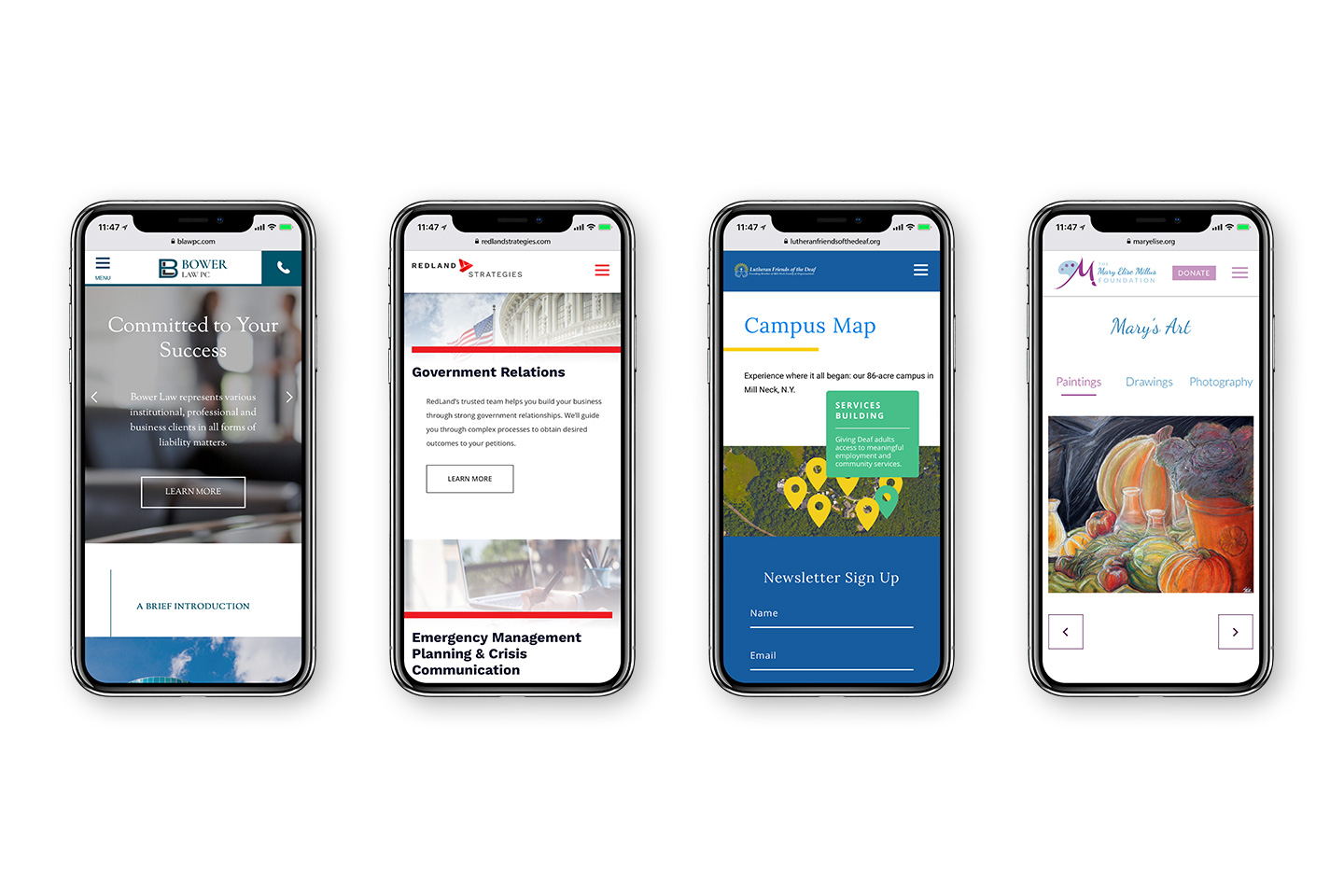
Going into 2018, simplified websites are becoming increasingly popular. People prefer seamless user-experiences, and users are drawn to simplified sites because it is deeply embedded in our brains. It all stems from cognitive fluency, which is in short, “…why you prefer visiting sites where you instinctively know where everything is and you know what actions you’re supposed to take.” We call this intuitive navigation.
While single page websites work beautifully from a designer’s standpoint, multiple simplified page sites are ideal for search engine optimized content. The solution then is for each page of a website to be treated like its own landing page. This works on multiple levels. Treating each web page as its own landing page ensures that a single webpage reads fluidly, with a clear purpose and a call to action. When running marketing campaigns, visitors are sent to one single page where everything they need to know is listed directly in front of them. There are no further steps to be taken, and no further pages to be opened. This builds trust between the reader and the company or organization, along with a coherent next steps path to engage with them.
Bringing it back to cognitive fluency, the brain will instinctively understand where to click and what to do. When web visitors are presented with a standalone page, they are tasked with doing what comes naturally, scrolling. With each page as its own unique site, the user learns the full story without having to search for additional about, mission and side navigation pages, just to bridge the gap and connect the very same narrative.
Simplified sites can allow for more interactive element opportunities, such as clickables, videos, buttons, boxes and animations. Top marketing influencer Neil Patel said, Interactive elements turn passive users into active participants. By upping user-engagement, user happiness is built up. User happiness leads to user conversions.
Supporting website designs with simplified user paths and navigation make the focus completely transparent. Storytelling takes the spotlight and guides the user throughout. A website’s user experience should be simple enough that its page numbers enhance it, not dilute its story. Without the muddling of link hunting, and guesswork derived from pointing and clicking, the overall brand message is strengthened ten-fold. The entire distillation of the website’s vision is laid out in front of the viewer.
Inclusive Illustrations
As a tremendous part of interfaces, design has a strong emotional impact on people, and it powers decision making. With a steady influx of innovative technologies, sites like Slack, Lattice, Gusto, Evernote, and Oscar Healthcare are relying on illustrations to portray diversity through inclusivity and communicate intangible concepts. We are seeing this in gender dropdown menus, illustrations of men, women and children of color, WordPress’s inclusive brand illustrations, Slack’s decision to add a brown hand in their design and inclusive design at Microsoft and diverse personas at Barclays.
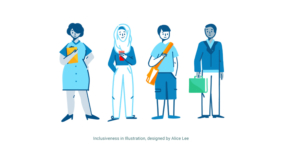
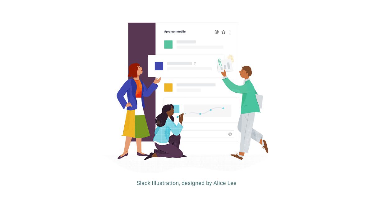
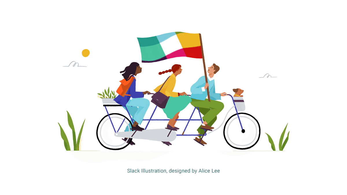
Designers are demanding inclusivity, and creating imagery that thoughtfully includes the diverse world around them, representing all audiences. However small they may seem, these decisions have a groundbreaking, resounding impact. Slack designer Diógenes Brito wrote, “We all have to work towards making inclusion an ordinary occurrence...Demand to see inclusivity in the sites and services that you use. Let the makers know how important it is to see a piece of yourself in the product. Little by little, we can help shape the world we want to live in.”
Mobile-First Technology
We need look no further than the 89% of mobile media time spent dedicated to apps to follow the native evolution of progressive web apps. Initially proposed by Google in 2015, progressive web apps were developed to combine the best of both mobile and web apps. When typically downloading apps, a number of steps are required before the actual app is installed and ready to open. This often creates a disconnect with users, and therefore results in a loss of customer retention. With the immediacy of the progressive web app, however, customer retention is gained. According to CMO by Adobe, truly successful innovation requires the Holy Trinity of Innovation: Imagination, Science and Timing. Requiring zero installation and upgrades, progressive web apps work across all devices and browsers. Ideally, PWA’s were developed to create a greater overall mobile experience for users. Progressive web apps embody all of the best parts of a mobile app, checking the complications and complexities at the door.
As of 2016, Google research showed that 53% of people are bound to leave a site that fails to load within three seconds or less. Yet, over 75% of mobile sites take 10+ seconds to load. Living in a mobile-first world, Google developed AMP (Accelerated Mobile Pages) as a solution to this problem. AMP was created to assist web developers and web publishers in creating quicker site experiences. Since its development, over 2 billion AMP pages have been published across more than 900,000 domains. Built on three core components, AMP does not require an extensive budget or team of developers. It was built for flexibility on existing frameworks such as WordPress. AMP was created for supporting all levels of functionality, allowing users to view image and video galleries, perform form fills and read through blogs quickly on their mobile devices.
2018 is for Everyone
In 2018, the digital space is being disrupted. Whether that means fearless design, diversified imagery, simplified web pages or fully integrated, fast loading mobile sites — the ultimate goal with digital design is always adaptation. We are shifting towards a balance of design thinking and feeling. Where design thinking applies empathy towards the user, design feeling includes intuitive interactive design. There is more talk surrounding the user experience and the correlations between the design, the messaging and the visuals being presented. This unified communication creates a more coherent, seamless end result. We are seeing inclusivity within design, and 2017 taught us — for better or for worse — that design is for everyone.